Artwork, Pin Striping, Graphics and Colours
If you are planning a custom paint job or have just painted your ride and it looks great but needs that extra something to put it over the top, you may want to have some artwork done. This is one area that I recommend you might need to get some outside help, unless you are artistically talented or doing something relatively simple. There is nothing worse than bad artwork to ruin an otherwise great job and similarly good artwork can make it a knockout. One thing you should consider when planning artwork, is if you get too “out there” you may tire of it soon, also very personalized artwork is not a good idea if you plan on selling down the road. Most people have a hard time imagining what to do or what it will look like. I suggest you look through magazines or take pictures at shows if you see something you really like, you can also have a professional drawing done of your ride with a couple of scenarios (same thing when choosing colours, it is often hard to visualize from a small paint chip). If you know of an artist whose style of work you really like, they will probably be able to give you some great ideas.
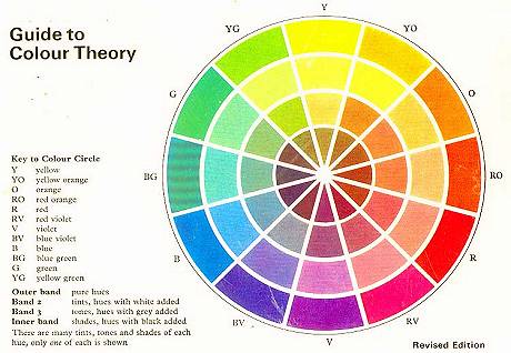
When I had my shop and the customer wasn’t sure what they wanted , I would do a casual interview to understand what they liked and disliked so I could make some recommendations. Since rodding is a very objective form, do not worry about what others’ taste is, it is your ride – do what is your style. Often with a custom colour like candy, artwork is not needed and striping tends to sit on top of this 3D type colour. Graphics are quite in vogue but be care full, if they are overdone or not done artistically, they can look tacky and choose your colours carefully. I often took the colour combinations of cigarette packaging when choosing complimentary colours for a graphic. I am sure you have seen a colour wheel, it displays the primary and secondary colours in a circle. Rule of thumb, when choosing a loud, high impact paint scheme use bright colours that are on opposite sides of the colour wheel, similarly when choosing a softer more conservative effect use colours that are on the same side of the wheel, this also applies to two tone schemes.


Hand pin striping can really wake up a plain Jane paint job for minimal cost. If you are just wishing to add a straight stripe to compliment a body line or scallops, this you can do fairly easily with some fine line tape a striping brush, some automotive lettering enamel and some patience. If you are outlining flames or looking for Von Dutch style free form striping you will probably be best off getting a pro to do this.
Airbrush work can really spice up a graphic, giving a real 3D look. Drop shadowing a flame job or scallops and a little shading can make a huge difference, transforming it from appearing stuck on to being inside the paint. If you are looking for a mural, the quality is directly related to the artist’s ability, be prepared to pay large for something done accurately.
One thing about art work, it varies in and out of style (remember the “heartbeat” or Van murals – ughh!). Current hot tribal or distorted checkered flag graphics may look passé in a year or two as another new style becomes state of the art so choose carefully. Traditional art work like flames tend to stay in style although often done with a new twist in colors or layout. Colours often go in and out, a few years ago Teal was hot, and pastels are still popular although Orange seems to be the hot one this year. We all love to see something new, a refreshing change from the ordinary, is Chartreuse the next one? Your guess is as good as mine.
John